Google Calendar is one of the foundation functions of Google schedule management. Recently a new version of Google Calendar Android app is released in response of Material Design. Has it become better or worse? Have a look.
Google is updating its apps with the brand new design. Calendar is one of the early prototype. But changes to the most frequently used app should be very cautious – a tiny mistake may affect thousands of users. (Isn’t it just like the early release of Lollipop?)
First look
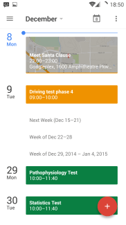
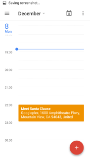
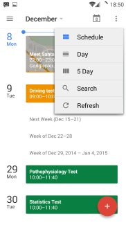
Material Design favors light colors, it’s been assured by Inbox and other apps. Light colors convey a feeling of peace and cleanness. Normal colors work better with lighter background, too. As seen on the pic on the left, Google now dares to utilize darker yellow and green since they just fit the UI well. I tried slipping my finger quickly upwards and downwards, but it’s sad – laggy (loss of frame) on the very latest of Android devices, it’s not supposed to be.
The blue line indicates current day and time, evolved from the previous version. One thing to mention, the default view isn’t day anymore. You may also have set month as the default view as you can have a glance just like at a real calendar. However, the new calendar makes schedule the first screen you’ll see. Probably they plan to show off their ingenuity of design. Despite my unwillingness, I did find the schedule is polished – If you don’t have appointments during a period of time, the schedule will collapse automatically by week. But in month view, I bet you’ll stay on the older version if the newer version hides unoccupied days in month view. It’s just unnatural for it. This is your first adaption: Embrace schedule, it looks smarter and more informative.
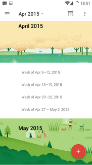
There are a few paper cut illustrations, separating the months with amusement.
The views
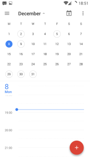
 Month view is exclusively designated to Month button. When you click “December”, a mini calendar pops out. There’s nothing but a circle around the dates that indicates you there’s at least an appointment on certain days. To learn more, you have to tap on the marked dates. This might be rather a controversial modification, challenging the app name: is a calendar supposed to be checked with so many moves?
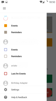
The rest of views are moved to 3-dot menu on the top right button which leads to my first confusion, why there’re two menu buttons (one side-bar drawer, the other 3-dot drop-down menu) out there?
On the official Material Design page, Google presented an example that seems to acquiesce it:
So this 3-dot button should be “More” button, but not Menu, or Settings. Yet by long-tapping the 3-dot button, it says “Change view”. I don’t know this magical button eventually means but it’s being ambiguous, not compatible with previous Android design.
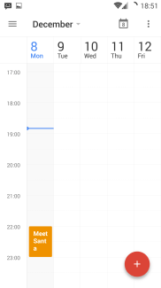
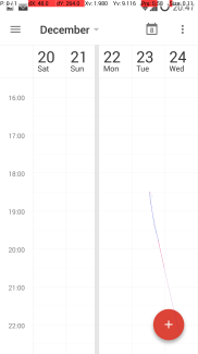
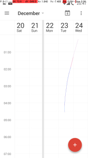
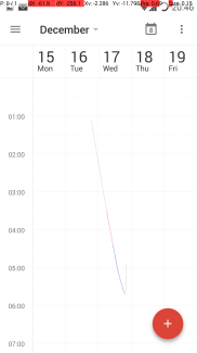
The 5-day view is similar with the old month view, but pinching to zoom won’t work. You can’t overview the appointments, only approximately 7 hours of activities are shown. Also, if you swipe your finger in a line which is strictly vertical or horizontal, your gesture will be misinterpreted.
These three pointer location overlay plots are meant to scroll the page up/down, and the calendar was reluctant and decided I was moving between days. Note that on big screen phones, when operating the phone with a single hand, this can be a harsh hassle as users are not so patient that can tolerate 3 consecutive failed attempts. This is your second adaption: learn to move your finger carefully and precisely.
Tapping the date on the left in day view brings you to schedule view. There are 3 ways to create an event:
- Tap the time on the left
- Tap the blank space which is not occupied by any event
- Tap the add floating button
And here comes another question: Method 2 works in any situation, why do we need another floating button? Is creating event a major task that mobile users do? Even if so, isn’t the second way much more intuitive?
Creating an event
The common parts are retained. Let’s fast-forward to what matters. Let’s say, I am going to meet Santa Clause today for Christmas affairs.
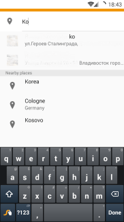
One improvement is the search suggestion in location text field. You can find the address of your friends, or exact location of the desired place, as you type. On the first pic, two friends appeared on the top. Once you finish selection, the address is attached to appointment. Calendar fetches map of destination and places it as a background. Not sure if it really helps, but it does look better.
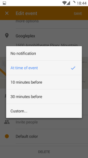
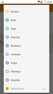
The time of notification can be set to a custom one, not only limited to some given time. Versatile colors are there waiting for you as well.
Be sure to click Save button after you have created your event. Back key now doesn’t save it for you. That’s the third adaption.
Integration
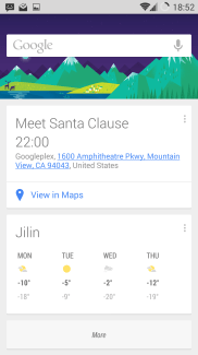
When you have created an event, Google Now checks if it can prompt you of traffic time by your favorite commute tool in time. Since Santa is too far from my current location, Google Now didn’t suggest time of commuting.
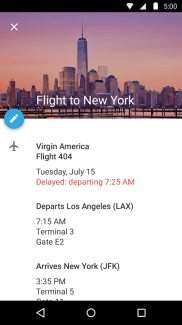
The image on the right is from Google Play, this appointment will be added if you have received an email of your flight.
Widget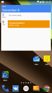
The widget changed a little bit. It always shows today as the first item and followed by next activity. Same as the old one, it can also be resized.
Tablet and mobile version
While I criticize the mobile version of Google calendar mercilessly, on the tablet version, the traditional good-looking month view is still there. I miss it so much but it’s only available on tablets.
Summary
Users’ reviews are already speaking for themselves. The new Google calendar really has much to improve. Usability is the first priority, and we hope the cute Google coding monkeys realize what are truly necessary to a normal user.

