
Inbox by Gmail is a new app from the Gmail team. We had a chance to get a closer look at it within the scope of its beta testing program. Enjoy!
Various Platform, Unified Inbox
On Oct 22, Google announced a new client for Gmail, “Inbox”. However, the word “client” doesn’t really indicate what it really is. Months after the boom of Material Design, the emergence of Inbox is almost another dose of epinephrine to those developers (and geeks, of course) who are becoming semi-bored. If you remember the evolution of Gmail, then it must be clear to you that Gmail was once an invite-only service. What does the new Inbox have to inherit and innovate? Let’s get a closer look.
The same old days
On the April fool’s day of 2004, Google announced their proud product, Gmail. However, the skeptical media and users were not going to believe immediately as Google does make jokes on April fool’s day. Gmail was rather favored, for its large free storage (second to none as free, at that time), stability and conversational threads. The invites for Gmail valued once up to $150 on eBay. Nowadays, Gmail is the most widely used web-based email provider in the world.
Inbox, shoulders the task to light the way that how the next-generation email service will be, it is no surprise that users will flock to get a very early chance for a test-drive. Over one million users have downloaded the Inbox app from Google Play, a definite proof how people expect it to be, at least, something “new”.
Lighter, swifter, and prettier
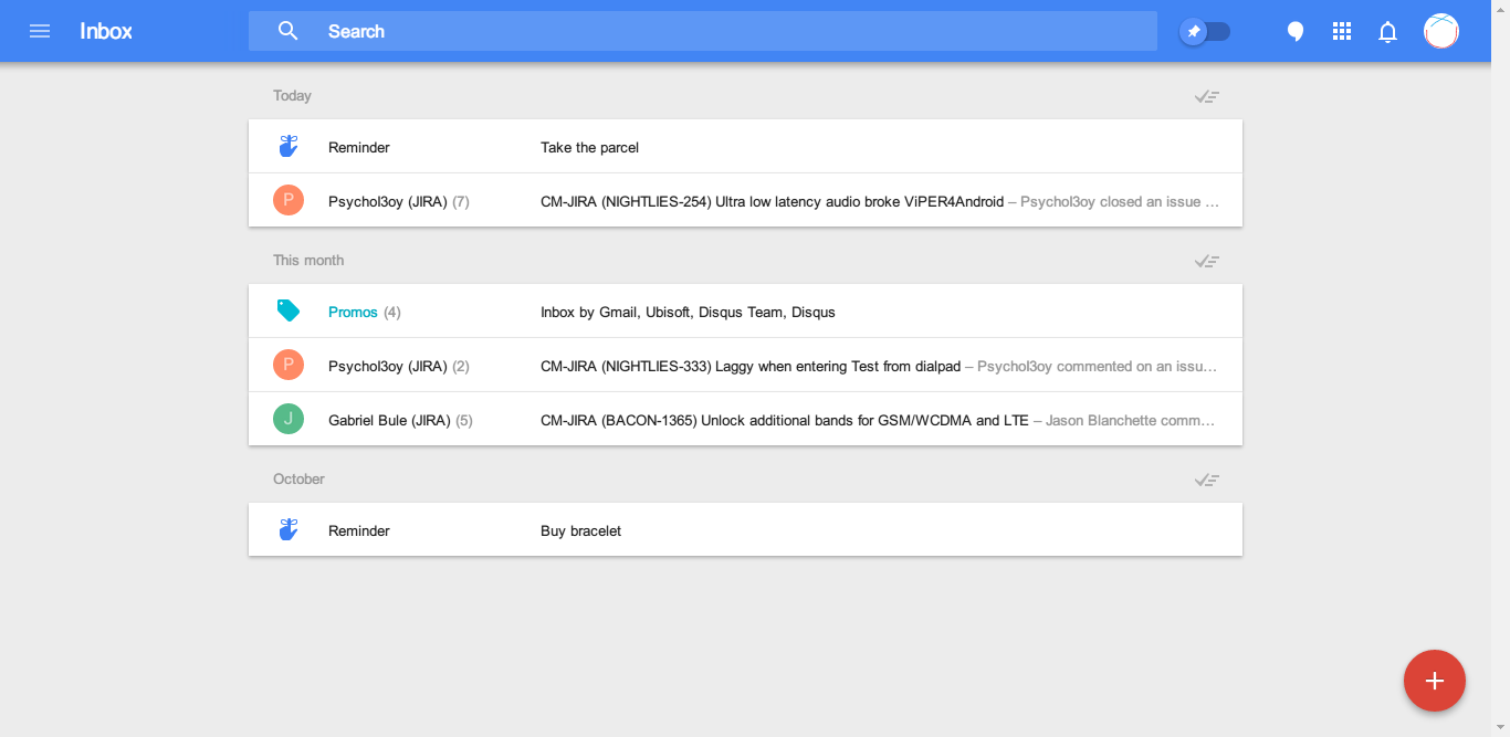
As presented at Google I/O 2014, Google is learning from Microsoft to bring the unified experience to all platforms. The main page of the Inbox can’t be more simplified. I personally was afraid the experience would be rather similar to how Microsoft does, as the web interface is so alike to a pad view.
However, Google doesn’t fail me. Simply press “c”, you’ll compose an email. Press “r” in an email, you reply to it. Everything handy was kept, while the swift animation of loading and transition reminds you, the age of technical art has come.
A fun fact is that, in Inbox, Google took away its beloved logo. The developers also know you’re not switching between various categories, so they grouped the emails and collapsed the label sidebar. No privacy statement, no storage usage, everything not related to email itself is stripped.
In Inbox, you never need to multi select emails and achieve them. No Promos? Ok, a click on “done” button and all promo emails are moved to “done” category.
As you may notice, Gmail takes seconds before it enters the page. Inbox, instead, chooses to load the conversation as you need it. Less contents loaded guarantees a speedy welcome.
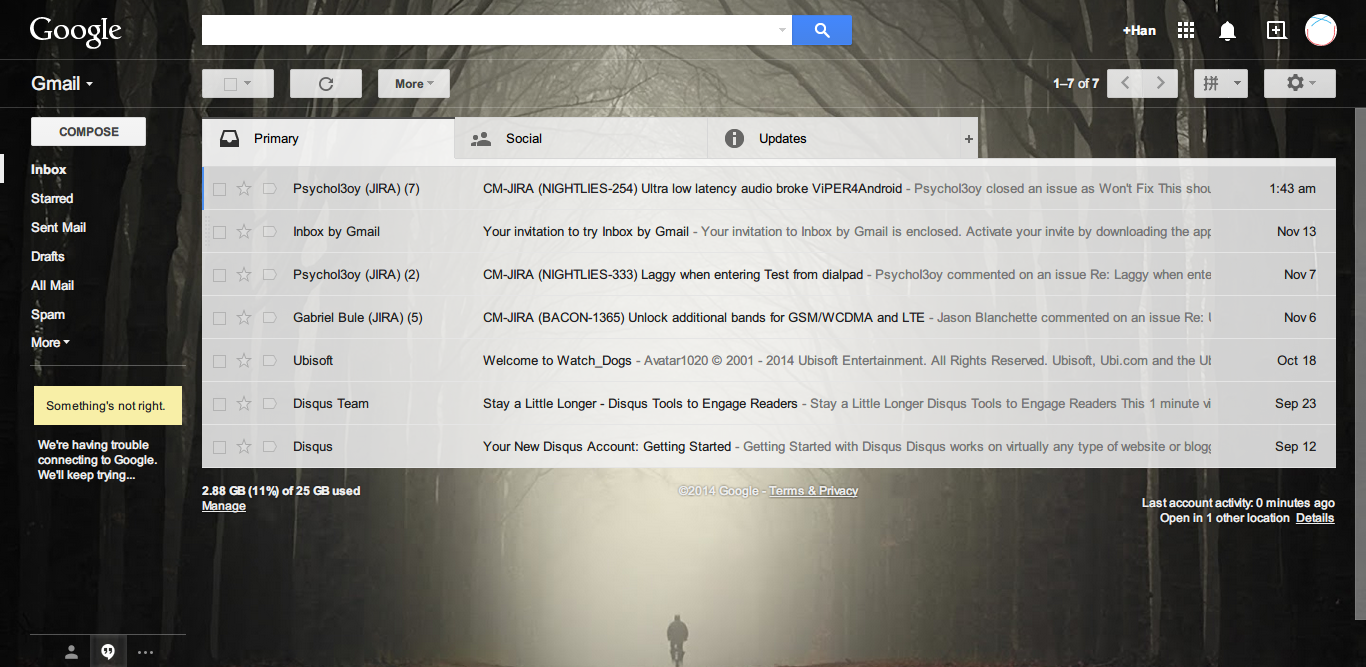
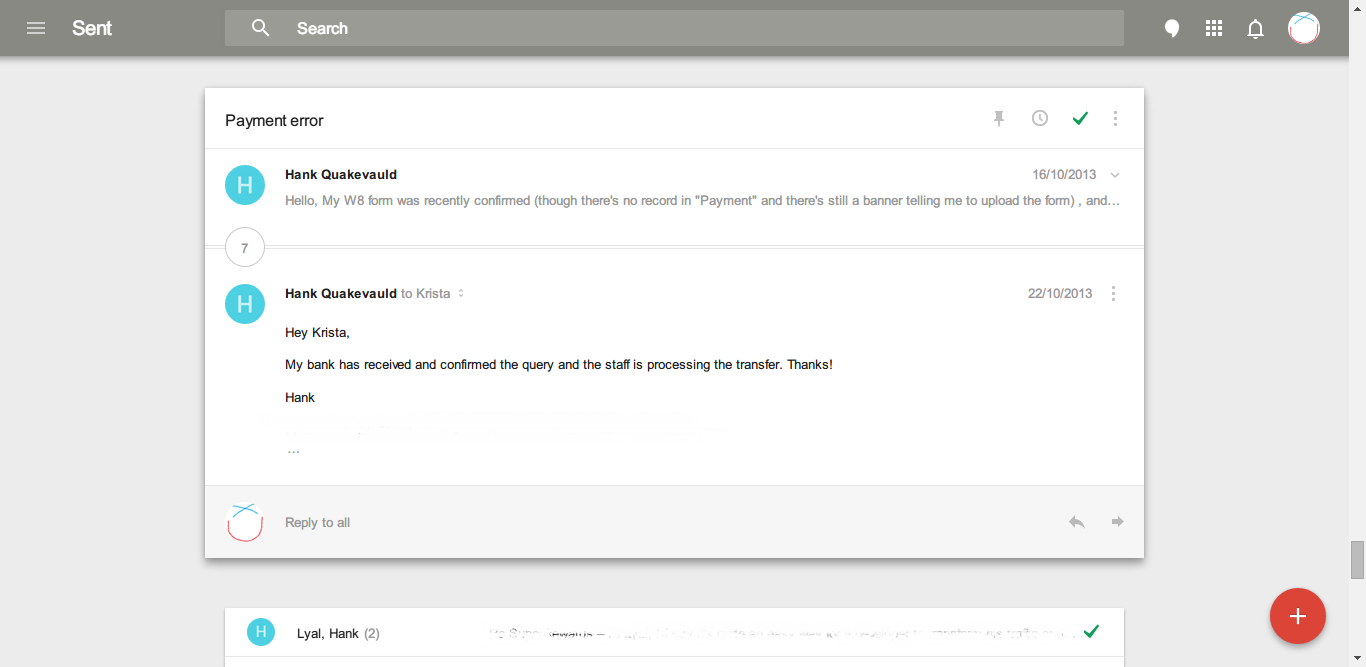
In the Sent Mail page, we can see the different logic of these two versions:

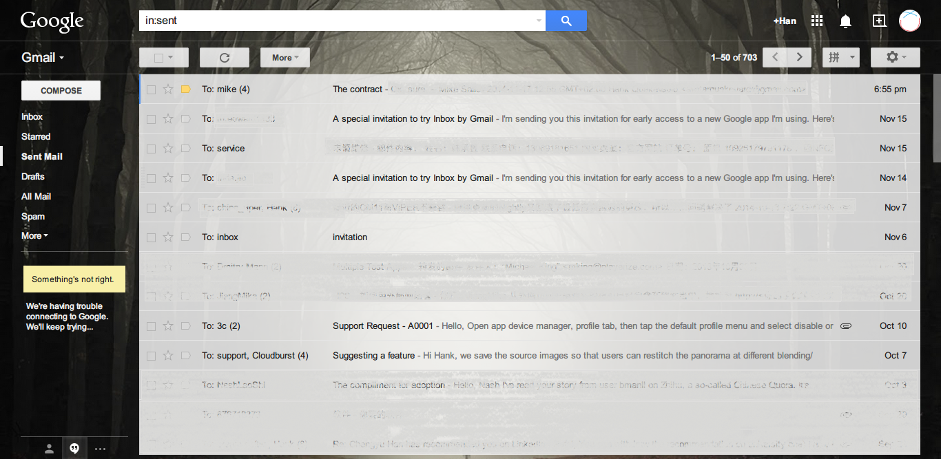
Inbox prefers a more conversational style, showing the real name to whom you’re sending emails; Gmail prefers the name extracted from email address. Anytime you want to move back a single conversation to inbox in Inbox, you just need to click on the green tick, so it is marked as undone; or to pin it, sticks to your inbox. In Gmail, it’s not possible to move conversations within just one click. The simplicity is obvious in every detail.
Never forget an important email
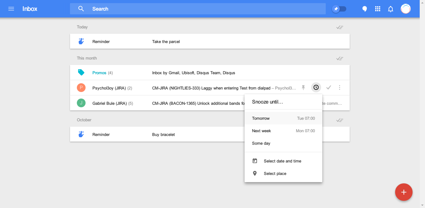
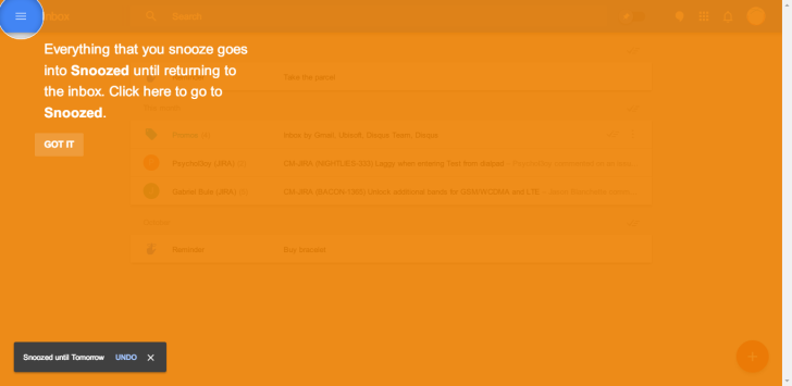
A brand new feature for Inbox is Snooze. It creates an alarm for important emails, in some occasions you must reply or review sooner. Once you create a Snooze, it will be synced to your mobile devices, ensuring you will be notified in time.
Note the Reminders are also integrated into Inbox. Reminders used to be created and viewed only on mobile devices (Specifically, Google Now). You can also set a Snooze for Reminders, and it will also be synced to Google Now, Google Keep and Inbox.
Small, but really considerate improvement. You don’t have to spam your calendar from now on. 😉
Material Design, one and for all
 Circles!
On Google I/O, Google made circles a major element besides squares. A friend of mine was very disappointed and complained about the unstoppable trend of circle-zing.
I believe that, Material Design is a friendly approach to normal users, not geeks. The colorful appearance, smooth animations and clean interface are always preferred on any size of screens.
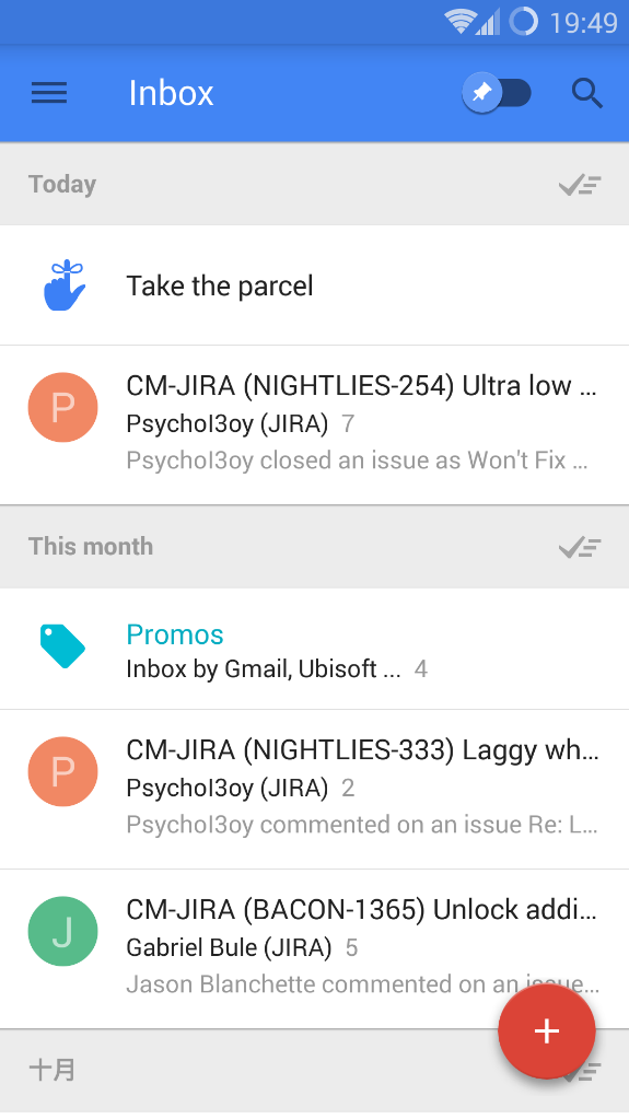
The mobile client Inbox on Android is almost a clone of the desktop version. Some mobile advantageous gestures have been kept (swipe to mark as done, or to Snooze). The general usage on desktop version of Inbox can be inherited to mobile one – brilliant way to reduce learning costs.
 During the testing of Inbox, I don’t feel Inbox is exclusively designed for touching devices. The mouse and keyboard control works flawlessly, too. Many actions have been optimized, e.g. fewer clicks and moves. On this perspective, Google knows that, tech adapts to people, not on the contrary. (Windows 10? Facepalm)
Conclusion
As personal use, the Inbox is suitable. It gets your need and gets better over time. The default categories bundled in inbox are good for most users in daily life. No more settings and you’re ready to make it your primary email client. The messier your email used to be, the more efficient in Inbox you’ll be.
However, if you’re using a work email, you may find the auto grouping feature not so useful. You will miss the IMAP and POP3 settings, you’ll hate to append your signature in the end of each email, you’ll be sad when you need to load emails at click.
But all in all, the beta version of Inbox is satisfying and much friendlier than it when Gmail was on closed beta. Many tips and guides appear just in time.
Is it going to be popular? Yes.
Is it going to replace Gmail? Perhaps.