Where there’s a file system, there’s a file explorer. Where there’s a file explorer, there’s a good explorer and a not-so-good one. Which popular Android file explorer would you choose for organizing your files on Android?
Most systems, excluding iOS and Mac OS X, store files in a logic of file system, an interface where user can access to his file only to remember the path. Exploration means you may do frequent actions between among paths. An efficient explorer is then a critical tool which determines if you finish the work fast.
The traditional explorers simply show you tree-like path presentation. Advanced users can head straight into the folders for dedicated uses, such as /mnt/sdcard/download for downloaded contents and /mnt/sdcard/bluetooth for transferred files via Bluetooth. Nonetheless, it requires prior understanding of system itself. iOS and Mac OS X, as well as freshly polished file explorers, provide an alternative, hoping to diminish user awareness of traditional file system and mask it with several “Favorites”. The latter is especially friendly to users who don’t plan to commit too much time in tweaking system. And as you see, capable file browser should be able to adapt to both demands. We’ve found two best welcomed apps for this purpose, follow me to find the one that gets you.
PS: File explorer is FX file explorer’s official name on Google Play. Hereinafter referred to FX file explorer for disambiguation against ES file explorer.
Welcome page
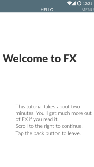
Not all apps can be used with ease without proper directions. Developers aim to improve the hand-on difficulty by two methods: Decrease the complexity by design; Prepare a welcome page at first run. Both explorer take the second method.
 ES File Explorer
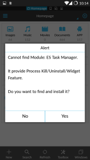
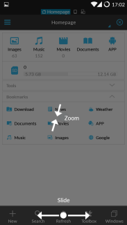
ES File explorer only demonstrated basic gestures: zoom and slide. The zoom is for hiding/showing action bars on the top and bottom, while the slide is for drawer menu and window/clipboard shortcuts. It’s good for impatient users that they aren’t expected to wait too long, but it can also be kind of simple and crude since no further explanation.
FX File Explorer
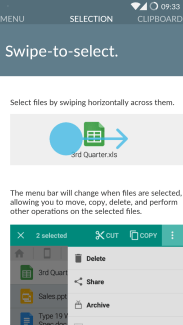
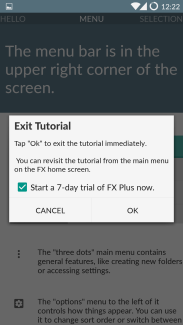
FX File Explorer favors a step-by-step tutorial. The tutorial instructs details of meaning of each icon. For special features, it’s a great idea to offer a chance to users to glance and learn in the tutorial. FX has many innovative ways of manipulating files, and I was just able to acquire them, rather than leave them unnoticed. The upper hand is, if the developer does have what he’d proudly present, it’s a plausible and decent practice. Downside is, some user
s just don’t have the patience to make even one pass.
Also one more thing to note, FX composed the tutorial in a non-interactive way. The screenshots are used once only. As a common sense, pictures take more space than codes and less intuitive than encouraging users to try on their own. Though evaluating the concrete text, it’s not that bad in this case.
Main page
ES File Explorer
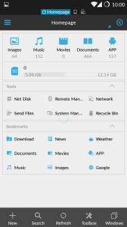
ES File explorer categorizes contents which are most meaningful to users in the first row. A mini gallery and media player are built in. Though they provide limited features, they make up the explorer as an indispensable part.
The second row is SD card usage (may refer to internal storage depending on specific device). It leads to the root path of SD card, though I was misled it was for some kind of cleaning.
For the tools part, Net Disk is mainly for Chinese users; System Manager is just a link to, I am sure, another app, which ES file explorer itself claims that to be a “module”; Recycle Bin, as the name suggests, emulates a place where enables the same functionality in Windows.
What deserve to be paid attention to are other tools in there. Remote Manager is a FTP module through which you can manage the files wirelessly, just like Airdroid. FTP is a common and widely-applied standard supported by mainstream systems. Send Files is like WiFi Direct, while WiFi Direct is still cutting-edge and seems immature for customers. I’ve tried WiFi Direct multiple times but all connections failed to establish. To use Send Files, looks like the target should also have installed ES File Explorer.
To my greatest shock, the so-called bookmarks share a logical disorder: Only Download is a physical location to the device, other are bookmarks of websites! I’m just wondering why Music should be linked to Google Play Music and Images to Google Images. Come on! You’re a file explorer, not a web browser!
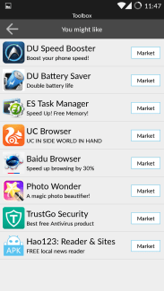 Well, it’s not the most astonishing surprise. By tapping “toolbox” you’ll see what “tools” are: It’s an utter promotion page! On the main screen of a file explorer and occupies a regular button in toolbar! What recommended there are chiefly Chinese apps, which evidently are some sort of alliance program. This is truly unacceptable and inappropriate in my humble opinion.
FX File Explorer
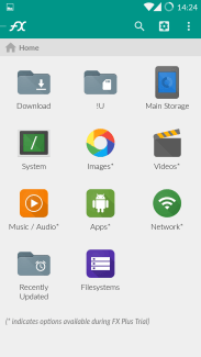 FX File Explorer presents the home page in grid by default, which can be adjusted to section or grid as you like, allowing you to customize the mostly visited folders as “bookmarks”. The interface is concise and clean, one tap leads straight to what you wish. The screenshot on the right is rearranged by myself. Unlike ES File Explorer, the bookmark links to physical and network locations (such as FTP, SMB and other protocols), but not webpages.
FX File explorer also provides smart categorized folders, all files of same type will be listed in one.
One sad point is, you can only decide which feature to be displayed and which is not; reordering the icons looks impossible.
Local file exploration
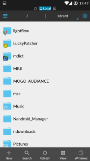
One considerate improvement for ES file explorer is its folder-label. It indicates what are known to be used by other apps with the app icon near the folder. It is a common practice that some apps have to read contents from storage other than /data/data/, since the data will be wept once the app is uninstalled. To keep backup and configuration files, apps may store it in /mnt/sdcard/.
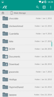
FX file explorer has similar indication, but it’s for system related folders and some data folders only. As seen, DCIM is for photographs, Download is for downloaded contents.
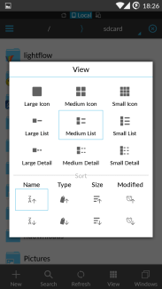
Relying upon different file types, the best view mode may not be suitable for another. You can always change it in View menu on the toolbar on the bottom. One primary example is to switch to icon mode when viewing pictures (or music with album arts).
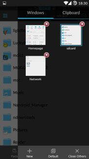
Copy-pasting is a major file action. On desktop systems, you’re able to open more than one window to cut, copy and paste contents within. Android itself doesn’t encourage the concept “window” in the system, but it doesn’t prevent developers from utilizing it in the app. In ES Explorer, you may swipe to switch between multiple windows, or tap Windows button to see a thumbnail of all windows.
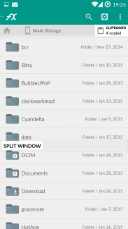
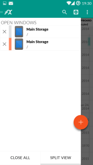
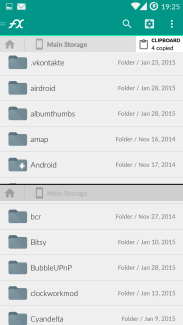
Both explorer perform well in all three modes, with proper info and consistent UI design. FX file explorer’s effort to look like Material Design app is visible, though many buttons are misused. One funny instance is the second picture above. The floating button should never be stuck onto the drawer.
File categorizing
You won’t be happy to look for your images scattered in different locations by digging into many different paths, even with the aid of multiple windows. Imagine what you mostly store in your phone. Are they photos, music, video and apps? That’s why a qualified file explorer should be able to put them in one place so you can save some minutes to have a cup of coffee.
Music tab is just a mess. ES File explorer just regard music files as normal files, only showing the album art. But it’s obvious that my album arts are not distinguishable to tell one song from another. I am sure it is not a single case. If you tap “Player” button, it presents with a playlist only, no option to sort or filter by any criteria. It’s anticipated that how much rage will music lovers encounter it.
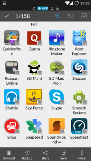
The app management inherited the logic from normal file exploration. You can change the view just as to normal files. You may also sort by name, type, size and modification date. Also you can selectively choose which kind of apps to be shown: system, user, installation location, updated etc. Despite the compact icons, app tab is barely passable.
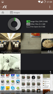
On the contrary, FX file explorer is much more competent. The image tab doesn’t only include up to 3 picture previews in respective folders, but also provides a pie chart so as to convey a grasp of how contents occupy storage.
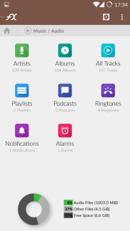
The music tab compensates icon indication in normal file exploration. Hidden folders on Android, for instance, Ringtones, Notifications and Alarms, are offered too. Also viewing by artist, album, playlist and all tracks reflects the love for music enthusiasts.
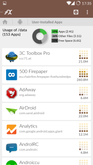
App tab is also well designed. The graphical notations are far better than simply non-impartation digits. The app list is cozy, with app package name. Can’t be better, authentically.
Network exploration
File explorer is no more for local files. We’re transiting to cloud, and network exploration is one critical component. The example is based on SMB protocol on local network.
ES file explorer
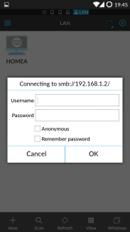
ES file explorer fully deserve the compliment in this round. It is able to scan available device in the same network. All you need to do is to provide credentials. Yet, you can also add a server manually.
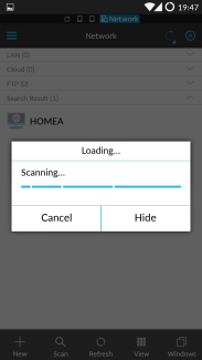
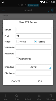
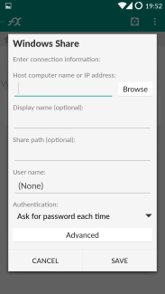 FX file explorer only supports manually adding servers. The supported types are roughly equal to ES File explorer.
Both explorer access the network location instantly and able to play media files stored on remote storage and perform well, yet ES File explorer notch above FX file explorer for its network discovery feature. It can be utterly useful in some cases (so that no need to confirm server IP and protocol etc.).
Conclusion
Both explorers are entitled to “best explorer” in Google Play. There’re some distinctions, though. ES File explorer applies old design style, the features are classic. You will not find it hard to get hands on, meanwhile you won’t have any surprise. FX File Explorer tries to apply latest design specification, though with glitches. It ensures more unified theme and usage, yet it probably will take some time before you master it.
But I personally would like to recommend FX File Explorer, just for the reason ES File Explorer is “infected” with promotion apps in a disrespectful means. A developer is supposed to hide promotion till the users are willing to support. Don’t you think so?


